Data Portrait
Description
The editor to the code is available hereI tracked my youtube watch history over the past week and tagged the videos as good, bad or neutral. I tried to represent this mainly through colors on a pie chart. I used data from youtube's history.
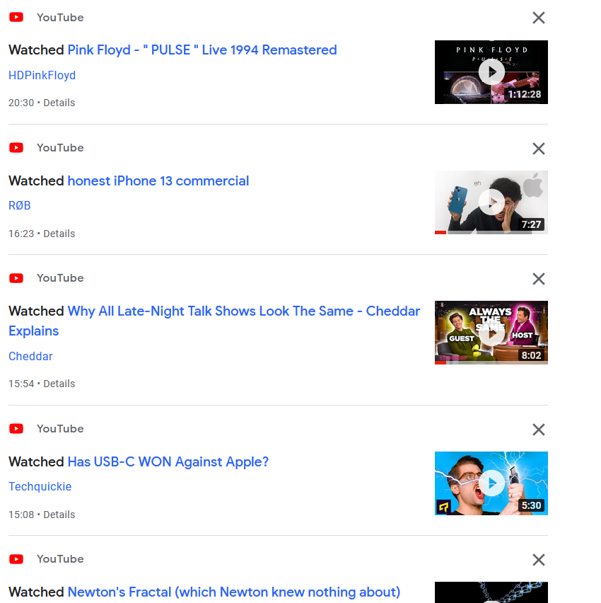
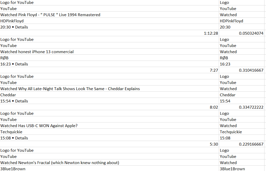
I converted this data into excel to make it easier to clean the data, remove information that wasn't necessary and to convert it into data that can be used by p5js.
Hovering over a day expands the day to allow the viewer to look at inidividual slices clearly, moving the mouse over the individual slices gives more info about the relevant video
Reflection
I always thought I was spending a lot of time on useless content in youtube, but looking at the data it is now apparant I'm using my time wisely on youtube. However, I wasn't ble to track if I stopped watching a video in the middle, so the data can be a little misleading at times.
Credits
I borrowed a piece of code from this implementation of Curved text by Tiri